
The Right Color Palette Can Supercharge Your Message
How Colors Can Shape Emotions and Boost Public Engagement in Government Campaigns
GOVERNMENT COMMUNICATIONS SOCIAL MEDIA
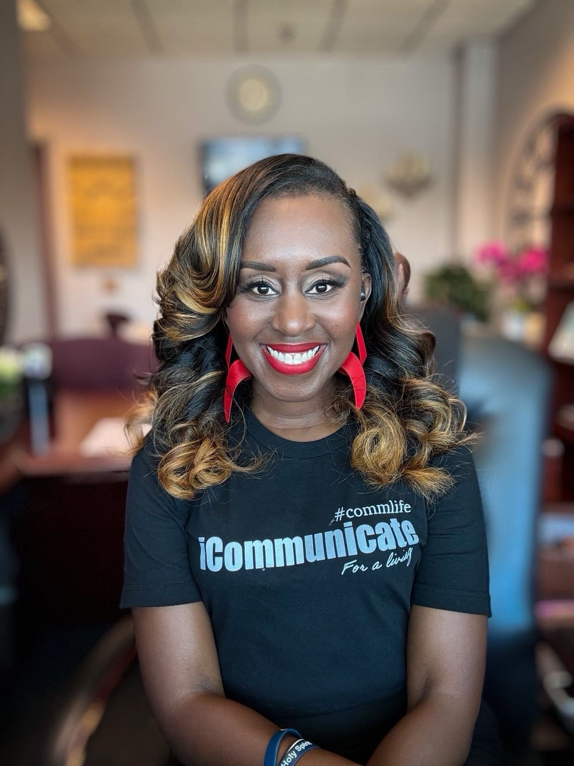
Thomas Y. Lynch
9/21/20255 min read


Working as a Communication Specialist early in my career, I created a 1-pager for a new health and campaign we were seeking employee participation. The initiative was essential to mitigate a spike in employee instances of work related stress.
I completed the rough draft and upon my supervisor’s review it was a hit! Except for one minor detail, the color. She liked everything except the color.
Pause here. As a creative we are often faced with “hills to die on” projects, this was mine. I used the color green with a pop color of blue. I used these colors not just because they worked well together - but they also set the emotional tone of the reader. My supervisor disliked the color green, and since she was the supervisor she wanted to have the final decision. Unpause.
I respectfully disagreed and pleaded my case - and eventually she agreed. But honestly the whole thing was taxing, and not needed. As a professional you would hope that your work and time spent in the profession would give you credibility and latitude to make simple design decisions - I digress.
I’ve learned that the right use of color can make or break how people engage with your message. In today’s online world, where scrolling is endless and attention spans are short, understanding how colors impact emotions is key to cutting through the noise. So what did I pitch to my supervisor to make her change her mind? I dove into the psychology of color and how it can help us connect with communities more effectively. I explained the power of colors, in this blog I will also cover some best practices that will allow you to think about how communicators can use color in their every day decisions.
Signifies power, elegance, mystery, and seriousness. However, it can also represent sadness or solemnity, particularly in the context of mourning.
Black
The Emotional Power of Color
Colors aren’t just visual—they’re emotional. They can spark feelings, shape perceptions, and even influence behavior. Here are some classic examples of colors and the emotions they’re commonly associated with:
Red: Energy, Urgency, Action
Red is the color of action. It grabs attention and creates a sense of urgency, which makes it perfect for campaigns that require immediate action—like disaster preparedness alerts or voting reminders. But use it wisely: too much red can feel overwhelming or aggressive. A splash of red in key areas (like buttons or headlines) can drive engagement without overloading your audience.
Blue: Trust, Calm, Stability
Blue is the go-to for government communications. Why? It’s associated with trust, reliability, and calmness. Think about police department logos, public health announcements, or environmental campaigns—they often feature blue to signal authority and reassurance. Online, blue backgrounds or accents can make your graphics feel professional and approachable at the same time.
Green: Growth, Health, Sustainability
Green is all about growth and balance, making it ideal for campaigns around environmental initiatives, public parks, or healthy living. It’s a color that feels fresh and optimistic, which can help foster a sense of positivity and forward-thinking in your messaging.
Yellow: Happiness, Optimism, Attention
Yellow is the color of sunshine and smiles. It’s great for grabbing attention and creating a sense of optimism. Use it for campaigns that celebrate achievements, promote community events, or encourage participation. Just like red, yellow is best in moderation—it’s bright and cheerful but can become overwhelming if overused.
Purple: Creativity, Wisdom, Aspiration
Purple carries a sense of creativity and ambition, which makes it a great choice for educational campaigns, arts programs, or initiatives that encourage out-of-the-box thinking. It’s also associated with wisdom and dignity, adding a touch of sophistication to your designs.
Gray evokes complex and contrasting emotions, from feelings of neutrality, wisdom, and professionalism to those of depression, boredom, and isolation
Gray
Why Color Temperature Matters
Color isn’t just about the hue—it’s also about the temperature. Colors can be warm (reds, oranges, yellows) or cool (blues, greens, purples), and this temperature plays a big role in how people feel when they interact with your content.
Warm Colors: These are energetic and attention-grabbing. They’re perfect for calls to action, highlighting deadlines, or promoting events.
Cool Colors: These are calming and reassuring. Use them for informational content, public safety updates, or anything that requires people to feel confident and secure.
Balancing warm and cool colors in your designs can create a visual experience that feels dynamic yet approachable. For example, the health campaign mentioned above I used a general green color to give the emotional temperature of something new, to sustain the ongoing commitment and focus on health. I used a vibrant pop blue for contrast and the color also conveyed trust and stability.
Conveys warmth, dependability, and wholesomeness, but can also be associated with disgust in some contexts.
Brown
Clean Graphics + Thoughtful Colors = Maximum Impact
Today people are bombarded with flashy ads, memes, and videos every second. To stand out, your graphics need to be clean, simple, and intentional. Here’s why combining thoughtful color choices with clean design is a winning formula:
1. Clarity Over Chaos: Clean graphics with purposeful color choices help your message shine. Avoid clutter—white space and clear typography give your audience room to breathe and absorb your message.
2. Emotionally Engaging: Pairing colors with the right tone of messaging can evoke the exact feeling you want. For example, a disaster preparedness campaign can use bold red for urgency paired with calm blue for reassurance.
3. Brand Consistency: Sticking to a consistent color palette across platforms builds trust and recognition. If your campaign uses green and blue, make sure those colors are carried through your website, social media posts, and printed materials.
4. Accessibility Matters: Choose colors with good contrast to ensure readability for all audiences, including those with visual impairments. Tools like color contrast checkers can help you design graphics that are both beautiful and accessible.
Often represents femininity, love, caring, and nurture.
Pink
Connecting with Today’s Online Community
Online audiences expect more than just information—they want connection. Thoughtful use of color can help your campaign feel human, relatable, and engaging. For example:
Social Media: Bright, eye-catching colors like yellow or orange can help your posts pop in crowded feeds.
Infographics: Cool colors like blue and green create a sense of trust and professionalism, making complex data easier to digest.
Videos: Warm colors in thumbnails can grab attention, while cool tones in the background keep viewers focused.
Associated with warmth, enthusiasm, creativity, and optimism.
Orange
The Wrap-up
Colors aren’t just decoration—they’re a tool for communication. When used intentionally, they can amplify emotions, guide attention, and make your government campaigns more impactful. Whether you’re designing for social media, websites, or print materials, remember that every color choice sends a message.
So, next time you’re working on a campaign, ask yourself: What do I want people to feel? Once you know the answer, let color do the talking.
Remember, in a world full of noise, a well-designed graphic with the right colors can be the bridge that connects your message to your community.
Thomas Y. Lynch
“How well we communicate is not determined by how well we say things but how well we are understood.”